HUMN
ELEMENTAL
Brand Direction & Launch Plan · August — September 2026
Technology changes. Value remains.
Ten days after the entity was formed,
we started with the story.
Three brand concepts were already sketched: a gradient tech look, a dark industrial copper direction, and a teal-and-lime variation — plus the idea of spelling out H-U-M-N as an acronym. The direction was still open.
The direction from the first call was clear: converge them into one confident identity, keep the human/element wordplay, and use the “hum” idea as the missing piece that ties it together. This document is that convergence — and the plan to build it.
Optimism
Material seriousness
Discipline
Three boards, read honestly.
Every decision is made against one test: does it hold at 16px on a phone, at 4K in a film, and in one ink on a certificate?
Closest to the register enterprise ITAD buyers respond to.
We keep- Carbon base and material seriousness
- Elemental Copper as the signature accent
- Infrastructure-first photography direction
- Neue Haas / Merriweather pairing
- Titanium as a second accent — it disappears next to copper
Strong ideas trapped inside a palette that will not survive print or film.
We keep- The H with the bridge — the best find in the set
- The thin-line icon language
- The dot pattern as a texture layer
- Numbered H-U-M-N cards
- The full rainbow gradient — it reads consumer app
- Logo on bright fills — it loses the material weight
Sharp instinct on system thinking; the color needs work.
We keep- The periodic-table element mark
- The Second Life media sub-brand idea
- Human-expertise photography
- Teal and lime — it reads generic sustainability
- One carbon base, one copper signature.
- H · U · M · N color used as structural coding.
- One icon language, one grid, one line weight.
- The bridge H and the element mark as the two proprietary symbols.
Technology changes.
Value remains.
Technology has become one of society's most essential resources. The way its lifecycle is governed hasn't kept pace with how much depends on it.
Today that afterward is fragmented. Data destruction is one vendor's job. Logistics another's. Recycling another still. Each task may be completed correctly, and yet no one is accountable for the whole outcome. HUMN Elemental exists to close that gap.
“Accountability is more than compliance. It is the discipline of making every decision, every movement, and every outcome visible, measurable, and worthy of trust.”
Our Mission — HUMN Elemental
Every asset, every option, its best next use.
Decisions routed on data: what is redeployed, what is resold, what is recycled — and why.
One owner of the complete result.
A single unbroken chain of custody, from the loading dock to the certificate of destruction.
Value returns to the cycle.
Recovered materials and redeployed hardware turn a cost line into a returned asset.
Extend useful life. Preserve resources.
Responsibility for the resource itself — not only for the paperwork that follows it.
The hum of trust behind intelligent recovery
Our recommended reading: HUMN is HUMAN reduced to its essential working parts, then restored to its highest use. That is literally ITAD — and the idea was already there in your own material.
It also reads, out loud, as the first syllable of “hum”: a steady, resonant tone that continues underneath noise and change. Technology changes, cycles end, devices retire — the hum keeps going.
Four elements that hold the entire brand.
H · U · M · N is the visual and verbal governance system. Each element carries its own color, number and promise, deployed across web, deck and video.
One base, one signature, four codes.
A direction to build from. It sets the register the site, the deck and the films are produced in.
Base surface. Material weight, quiet by default.
Structure, panels, separation.
Type and clarity. Warm off-white, easy on screen.
Signature accent — the color of recovered value.
Reserved for AI, data and intelligence moments.
Element system colors
H · U · M · N are structural. They code elements, roadmap phases and scope layers, one at a time, always with a job to do.
Color balance
The proportion is the rule. Copper works as a signature: kept under a tenth of the frame, it holds its meaning everywhere it appears.
- Carbon40%
- Graphite25%
- Mineral White15%
- Copper10%
- Element coding5%
- Intelligence Blue5%
Two proprietary marks, one system.
The bridge H carries the promise. The element mark carries the system. Both survive one ink, one color, and one centimeter.
Two uprights held by one crossbar. Trust, connection, exchange — the single strongest idea in the reference boards, rebuilt on a strict grid.
Periodic-table logic: symbol, number, name. It makes the H · U · M · N system legible at a glance, from favicon to film title card.
symbol + wordmark
Stacked, horizontal and symbol-only. One clear-space rule: the width of an upright on every side.
Reversals and one-color
Element marks in the system
How it reads, how it looks.
Engineered sans for the system, an editorial serif for the human voice, and photography of the real work: rooms, hands, materials.
Typography
Technology Changes. Value Remains.
Neue Haas Grotesk / ArchivoThe one typeface all three boards already agreed on. Tight, engineered, built for systems.
Accountability is more than compliance.
MerriweatherFor the mission, the Journal and Second Life. A serif signals a human wrote it — which is the entire point.
Photography direction

Scale and technical credibility. Data centers, racks, circuitry.
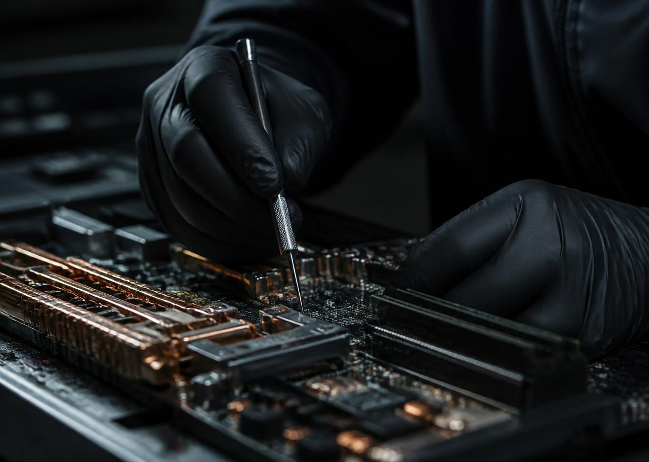
Real hands, real inspection. Never stock handshake imagery.

Recovered copper and gold: tangible proof of the circular claim.
“The hum of trust behind intelligent recovery.”
Motion reference — the visual register the Hero's Journey and VSL will be produced in.
One brand. Three layers of impact.
Platform
The website as the center of enterprise positioning: narrative, architecture, SEO foundations and the structure for the trust package.
Argument
The living deck as a commercial tool: updated, corrected, and present in every conversation with clients and partners.
Emotion & conversion
The film system: the story that makes them feel it, the piece that converts, and the piece that answers objections.
Proposed launch roadmap.
Target milestones, secured upon project approval and kickoff. Select each one to see its scope and deliverables.
HUMN Elemental Website
First delivery and public starting point of the brand: the platform where enterprise ITAD and technology lifecycle positioning come to life.
- Site architecture and applied brand narrative
- Elemental visual system (H · U · M · N) in production
- SEO-technical foundation for B2B acquisition
- Structure prepared for the trust package and certifications
A living process,
with a single owner.
Short review cycles
Every deliverable is presented in progress, corrected, and approved. Each stage closes with the work already seen.
One shared system
Web, deck and film run on the same visual, verbal and sonic system. Everything reinforces everything else.
Documents that stay alive
The deck and the site evolve in place throughout the agreed production period, as the business and the trust package develop.
Accountability as practice
The same principle the brand sells is the one applied to the project: ownership of the complete result.
Inputs to confirm today.
The decisions that allow us to move from direction into production.
The commercial + nonprofit design is structural. We need it described accurately before it goes public.
- Legal entity names and how they relate to each other
- How reinvestment actually works in practice
- Which claims are ready to be stated publicly today
- Which certifications and audits belong in the trust package
Message priority depends on who we are speaking to first, and in what order the services are sold.
- Final wording and priority order for the core services
- Target verticals to lead with (data centers, financial, healthcare, government)
- Reference ITAD sites for calibration — not imitation
- The objections that actually come up in enterprise conversations
Co-branding requirements shape the logo system, the footer and the credibility layer of every page.
- Metaluck and Better World brand guidelines and usage rules
- How the partnership is named and credited across surfaces
- Decision on Second Life as a media sub-brand
- Ownership of photography and the November live-action shoot
Fixed dates are already committed. What we still need is what the dates have to serve.
- Events the launch has to support, with names and dates
- November trip window for the live-action production
- Who approves each deliverable, and in how many days
- Volume of content at launch vs. content added continuously after
One communication system, two phases.
The platform establishes credibility, the deck articulates the argument, and film creates emotion and conversion.
Brand & Digital Foundation
Brand direction + visual system + website + corporate/sales deck.
USD 12,000Storytelling & Conversion Films
Hero's Journey + VSL + Objections Film + motion design + AI-assisted production and post.
USD 18,000Phase 01 + Phase 02
When both phases are commissioned as one integrated launch, the total investment is USD 28,000, because strategy, creative direction and production assets are shared across the entire system.
Technology's Second Life
starts here.
Next step- Approve the direction
- Confirm Phase 01 or Complete Partnership
- Kickoff immediately
- Target website launch: August 27
HUMN Elemental · Accountability for digital infrastructure